

Introduction
One way to utilize Storybook is by creating self-documented libraries and design systems as we develop them. How can this be achieved?
Using independent building blocks, developers/programmers can create UI components separately with the help of Storybook. Storybook gives the ability to create the UI components with your preferred framework and provides a clean interface for working on each component.
This blog will focus on points such as:
- What is a Storybook?
- Why do we need it?
- How to integrate it in React JS.
- Storybook Deployment.
- Conclusion

What is a Storybook?
You can construct and present UI components apart from your main application using Storybook, a strong development environment. Without having to run your full programs or deal with data, APIs, or business logic, it makes it easier to build complex scenarios and edge situations. Storybook provides smooth integration with its support for well-known frameworks like Vue.js, React.js, and angular.
Storybook for React Native
Storybook also supports React Native, enabling developers to build and document mobile UI components in isolation. As a React Native development company, we use Storybook to streamline mobile component development, ensuring native-like performance and scalability for iOS and Android apps. While setup differs from React JS (e.g., requiring device or emulator integration), Storybook’s isolated environment enhances collaboration and testing for mobile projects
The idea of a "story" in Storybook is unique. A narrative serves as a dynamic entity that captures numerous states and behaviors, representing the rendered state of a UI component. Developers may quickly investigate many component versions and edge cases from a single, separate page by using tales. This streamlines the creation of reliable and adaptable websites by doing away with the necessity for manual testing or in-depth analyses of the application's codebase.
Using Storybook in your application has the following advantages
-
Showcase of Documentation:
Storybook offers a great platform for displaying thorough documentation and highlighting the specifics of how UI components were implemented.
-
Testing New Configurations:
It enables testing of new configurations prior to developer interaction, ensuring that modifications function as intended and minimizing potential errors.
-
Simple Implementation:
Storybook enables you to create standalone components for your tales that are separate from your main application. This streamlines the implementation procedure and makes it simpler to manage and test individual components.
-
Code Redundancy Reduction:
By using Storybook, you can avoid writing duplicate code because you can easily use existing components in your application. This encourages code reuse and prevents pointless repetition.
-
Documentation and Guidance:
By offering thorough documentation and instructions on the use and behavior of application components, Storybook acts as a helpful resource for both current and future developers. It guarantees consistency and makes components easier for developers to comprehend and use efficiently.
So, let's explore Storybook and see how it works in practice!

How to integrate it in React JS ?
We will use Vite for quick react setup and it also works smoothly with the storybook library.
1.Create an empty react project with Vite
Go to your suitable directory. Open a terminal and run the following command to create a react project.
| yarn create vite <foldername> --template react |
2. Install Storybook in your React app
Now, we will install the storybook with our react-application using the npm command.
| npx sb init |
This command will help us to setup storybook in our locally. We can see that it has created a folder called. .storybook and in src folder src/stories as well. Also, create a script for us to run storybook. Amazing and helpful right!
Do make sure that all packages are installed properly by running, in case:
| yarn install |

3. Time to run boilerplate! 🔥

giphy.com
Run the command:
| yarn run storybook |
After running the line in terminal, you can see the storybook on port: 6006, it is default port taken by storybook. URL: http://localhost:6006/

As we can see they have already provided some components such as buttons, header, and page. You can dive deeper into check that premade component but for now, Let us make our UI block/component called message block UI.
4. Create message UI.
This UI component will have different cases such as success, warning and error.
Create a different file in stories in src.

Hope you are following me and everything is working on your side!

giphy.com
-
Make
Message.jsxfile and paste the following code:
| import React from "react"; import "./message.css"; export const Message = ({ mode, label, ...props }) => { return ( <div className={["storybook-message", `storybook-message--${mode}`].join(" ")} {...props}> {label} </div> ); }; Message.defaultProps = { mode: "success", label: undefined, }; |
-
Make
message.cssfile with the below CSS:
| .storybook-message { font-family: 'Nunito Sans', 'Helvetica Neue', Helvetica, Arial, sans-serif; border-radius: 1rem; cursor: pointer; width: fit-content; font-weight: 600; padding: 1rem 3rem; text-align: left; color: white; } .storybook-message--success { background-color: rgb(1, 226, 1); } .storybook-message--error { background-color: rgb(255, 55, 55); } .storybook-message--warning { background-color: rgb(255, 179, 37); } |
-
More important file to create an actual story
Message.stories.jsxfile,<your-file-name>.stories.jsxdetected by your default Storybook configuration. And use the code:
| import React from "react"; import { Message } from "./Message"; export default { title: "Example/Message", component: Message, argTypes: { mode: { control: { type: "select", options: ["success", "error", "warning"] } }, }, }; const Template = (args) => <Message {...args} />; export const Success = Template.bind({}); Success.args = { mode: "success", label: "Action is success!", }; export const Error = Template.bind({}); Error.args = { mode: "error", label: "Action is failed!", }; export const Warning = Template.bind({}); Warning.args = { mode: "warning", label: "Beware, you are changing something important!", }; |
And with this, you are done! Now you can see your message component in localhost, something like this. 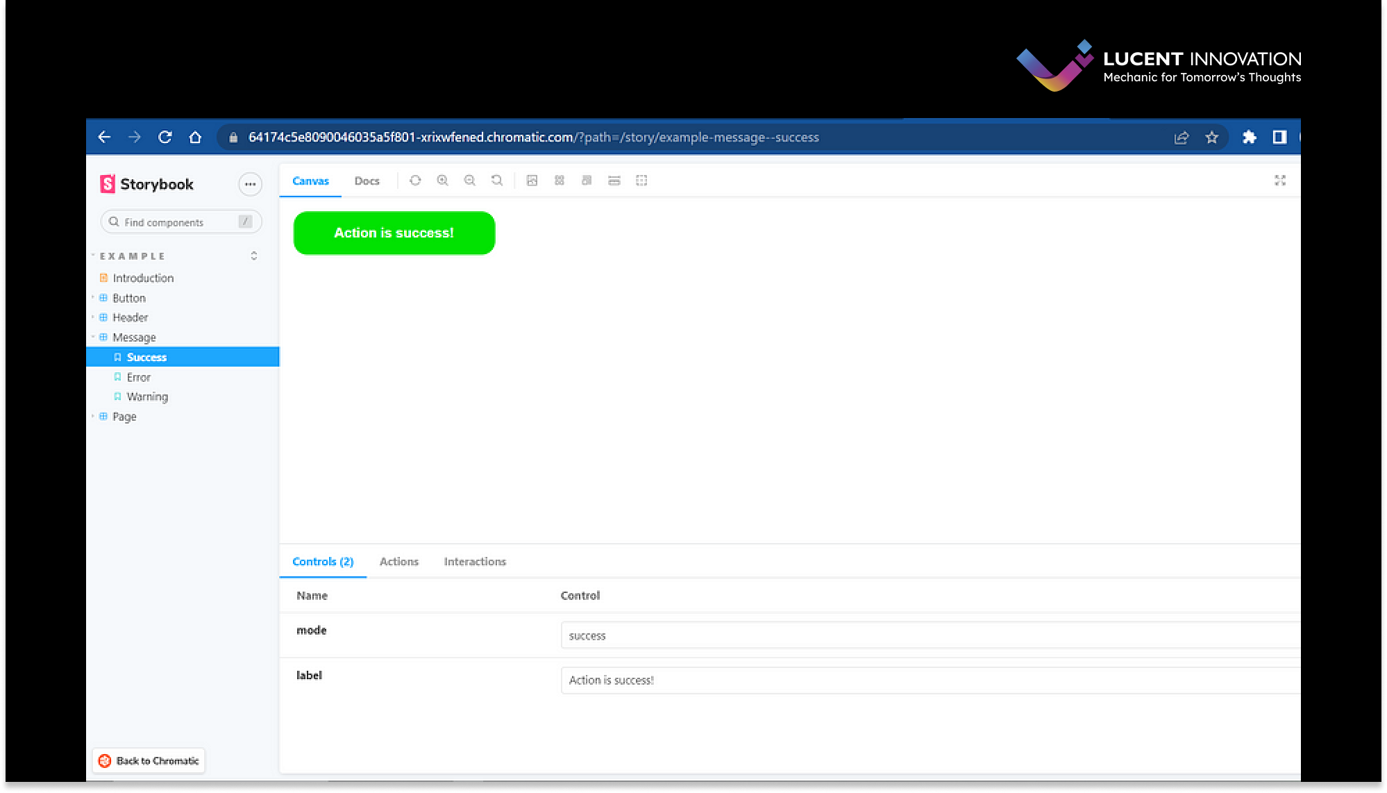
As we can see, we have created a component with two types of props that can be controlled live on the storybook interface as well!
With this, any present or future developer can see all component available and their use cases simply and interactively. It helps the developer to quickly check all arguments/props are there and how to use them.
5. Let’s use it in our application!
Add the following code in App.jsx or any file as per your choice and see the result by running our react app:
| yarn devimport { useState } from "react"; import { Message } from "./stories/Message"; import "./App.css"; function App() { return ( <div className="App"> <Message mode={"success"} label="Success" /> <Message mode={"error"} label="Error" /> <Message mode={"warning"} label="Warning" /> </div> ); } export default App; |
Output: 
Awesome! You have successfully created and implemented a storybook with react. Now you can create a common component and make it available and let them know by putting on a storybook.
Let’s deploy the storybook! 
Photo by Yogi Purnama on Unsplash
Now we can deploy our storybook so that it can be easily accessible by URL as well. We will deploy it on GitHub pages as it is a quite straight forward process.
To deploy Storybook, we first need to export it as a static web app. This functionality is already built-in to Storybook and pre-configured.
| yarn run build-storybook |
This creates a static Storybook in the storybook-static directory, which can then be deployed to any static site hosting service.
-
Create a repo on GitHub and push your code to it with the help of commands as
| git init git remote add origin <remote-url> git push -u origin main |
-
We will use Chromatic, a free publishing service made by Storybook maintainers, to deploy our static folder.
-
Run the command:
| yarn add -D chromatic |
While installation is happening, sign up/sign in on chromatic with GitHub and choose your repo from it.
-
After selecting your repo, it will provide you with a project-token such as `npx chromatic — project-token=<token>` and run it in your root folder terminal.

-
Now follow the further steps on https://www.chromatic.com/setup?appId=<your-id> link available in terminal.
-
After completing further step, you can see it on the dashboard and click on “view storybook” button:

Yahoo! you have smoothly deployed your storybook.
-
If you want to create Continuous deployment with Chromatic, you can refer this official documentation:
https://storybook.js.org/tutorials/intro-to-storybook/react/en/deploy/

giphy.com
Conclusion
It’s simple to understand why Storybook has quickly become massive among developers. Working on isolated components in a tidy interface saves a tonne of time, and the opportunity to visually test your code is too good to pass up.
Other resources and reference to know more about it:
Integrating Storybook with common frameworks for developing components for UI has proven to be a game changer. It streamlines the process, encourages collaboration, and gives developers the ability to create exceptional user interfaces. At Lucent Innovation, our talented developers leverage the power of Storybook to deliver world-class solutions. Ready to take your UI development to the next level? Contact our team today and let us help you unlock the full potential of Storybook.
Hope you learned something about storybook. Thanks! 😺
Also, read: Handling Memory Leaks in React for Optimal Performance
